Phones
Mind the notch – designing your mobile site around the latest smartphone fad.

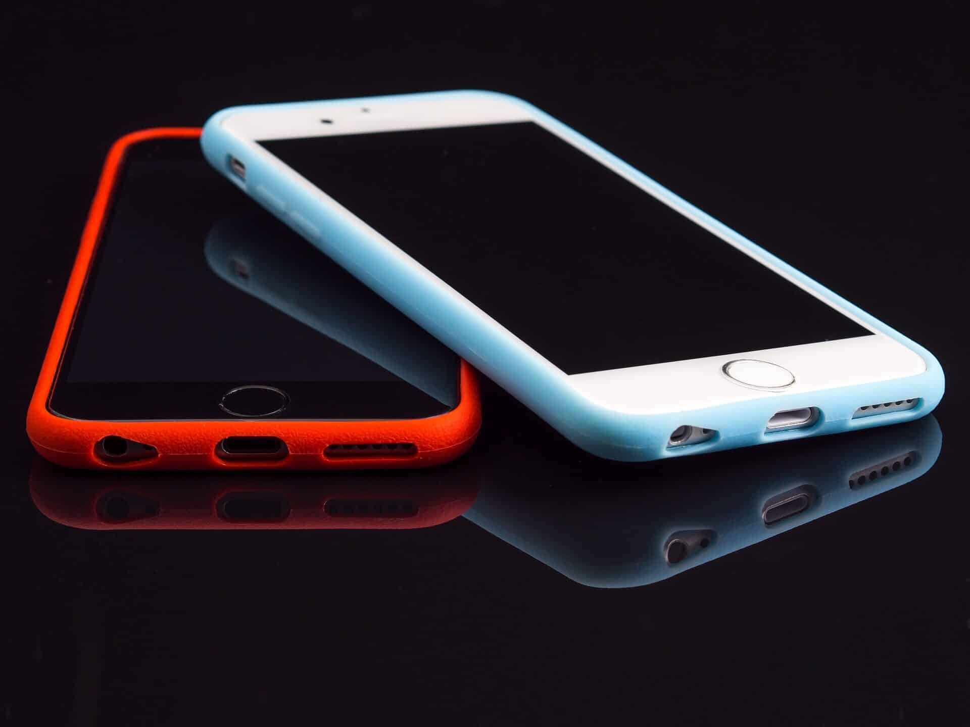
The design features on smartphones are a little like the hairstyles on boy bands. You see something subtly different somewhere, and within a week, everyone else is doing it. When the iPhone X came out to celebrate a decade of the handset that gave our phones the smarts, there were, as expected, a raft of exciting features that the other manufacturers could not wait to imitate.
Face recognition and wireless charging were obvious examples, but a seemingly innocuous design feature in the screen itself could have the more far-reaching implications.
Notches, notches everywhere
The notch – essentially a black bump along the top of what was formerly a perfectly rectangular screen – can mean you end up unable to see a portion of the website you are viewing. Whether you view in landscape or portrait, and even if you view in full screen, that annoying notch will still be there.
Contrary to popular belief, the iPhone X was not the first to have this notch. That honor actually goes to the Essential Phone PH-1. The difference is that when that was launched in May 2017, nobody paid any attention. Since the launch of the iPhone X, at least six other smartphones have appeared bearing that smartphone equivalent of the latest boy band haircut, including offerings from Google, Asus, LG and Huawei.
Implications for mobile web design
Anyone who has been paying attention to their digital marketing and SEO consultants will know that two of the most important things to get right in web design are user experience and mobile optimization. These are fundamental to everything you do. Right from the start, before your site is even up and running, factors like these are at the forefront of your mind, and when you look at this list of the best 10 website builders, you will see that these are among the key criteria by which they are assessed.
The notch, then, manages to throw a spanner in the works of not one but two key aspects of mobile web design.
Designing around the notch
Apple at least had the presence of mind to see that a certain furor might surround the new notch, so it shared some guidelines that allow you to “take advantage of the new notch.” Clearly there is a degree of political spin in the wording, but the idea is that its viewport-fit add on will help your website to become not just mobile friendly but notch friendly. An additional CSS function helps to keep important text and images in the “safe area,” avoiding the annoyance of buttons or menus being obscured.
It could be argued that in today’s multi-platform world, it is a mistake to design with too much emphasis on one single device. However, when that device is the world-leader in the most ubiquitous platform of all, and is the style setter that is rapidly imitated by its key competitors, it would seem an even worse decision to simply ignore it and hope the fashion will blow over.
-

 Phones6 months ago
How Do I Know if My Phone Supports AR?
-

 Tech6 months ago
Does Astigmatism Affect Your VR Experience?
-

 Business5 months ago
How Do You Make an AR Without Coding?
-

 Phones5 months ago
What To Do About That Weird Notification Sound on Android?
-

 Tech5 months ago
How Can I Get Google Drive 1TB for Free?
-

 Phones5 months ago
How Does SnapDrop Work? – Instant File Sharing Made Easy
-

 Tips and Tricks5 months ago
Can You Use Windows VR for Sculpting?
-

 Tech4 months ago
5 things you’ll miss after switching to iPhone from Android


