Development and Hacking
Google Maps got a new look

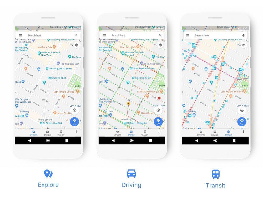
Google has once again redesigned the look of Google Maps. They now adapt better to their respective use when driving, navigating, using public transport or exploring the surrounding area – thus highlighting the information that is relevant in each case, for example petrol stations.
The changes will gradually be visible in the next few weeks in all Google apps that display maps.
In addition, they have revised the colors and added many new symbols. The various food icons are now orange, shopping blue, entertainment turquoise, services purple, health red.
-

 Gadgets6 months ago
Can Dogs Use VR Headsets?
-

 Tech6 months ago
What Does “Voicemail Pending” Mean?
-

 Phones5 months ago
How Do I Know if My Phone Supports AR?
-

 Tech5 months ago
Does Astigmatism Affect Your VR Experience?
-

 Business5 months ago
How Do You Make an AR Without Coding?
-

 Phones5 months ago
What To Do About That Weird Notification Sound on Android?
-

 Tech4 months ago
How Can I Get Google Drive 1TB for Free?
-

 Phones4 months ago
How Does SnapDrop Work? – Instant File Sharing Made Easy


